| Music |
| Songs |
| Song Years |
| Song Artists |
| Song Titles |
| Song Charts |
| Albums |
| Album Years |
| Album Artists |
| Album Charts |
| Site Index |
How do I read the region profile pictures?
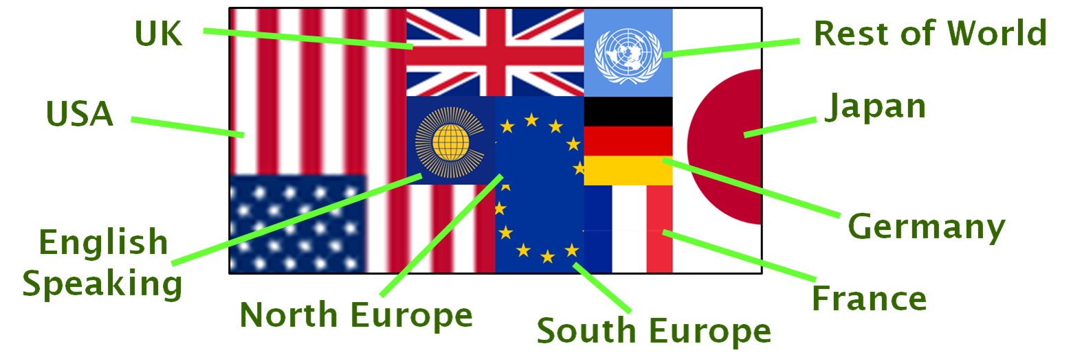
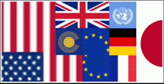
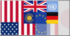
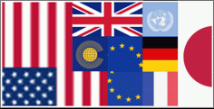
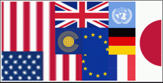
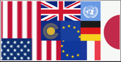
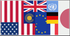
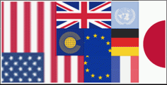
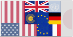
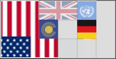
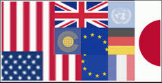
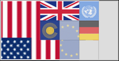
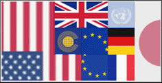
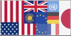
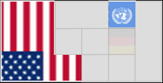
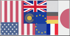
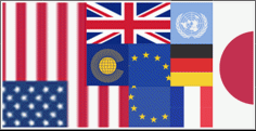
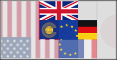
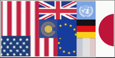
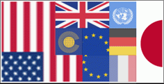
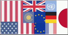
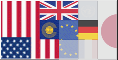
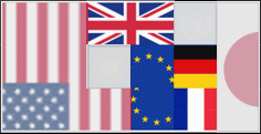
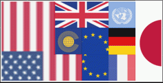
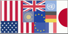
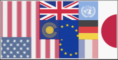
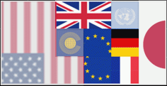
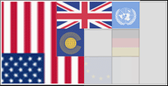
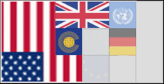
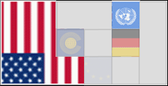
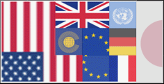
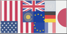
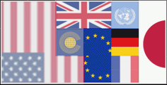
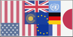
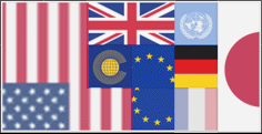
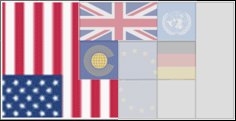
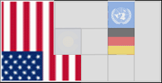
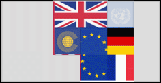
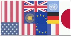
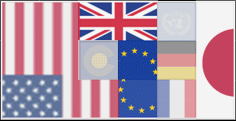
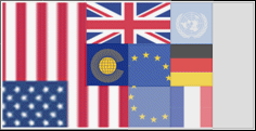
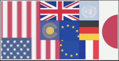
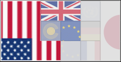
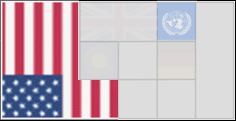
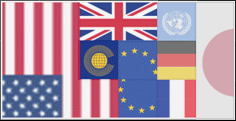
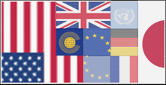
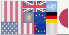
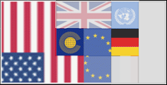
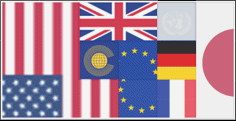
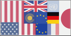
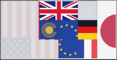
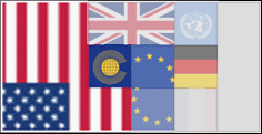
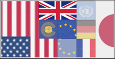
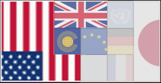
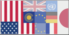
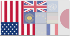
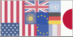
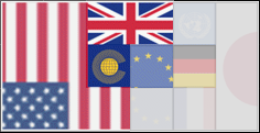
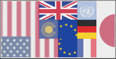
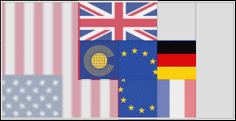
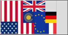
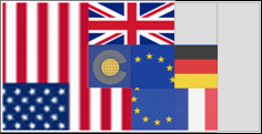
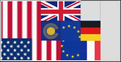
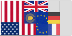
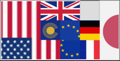
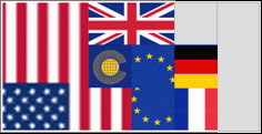
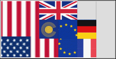
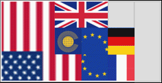
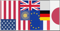
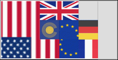
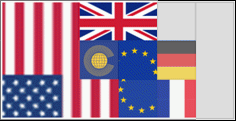
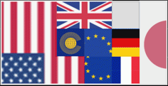
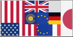
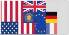
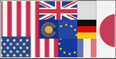
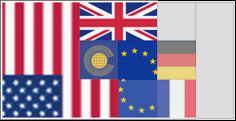
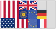
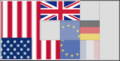
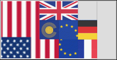
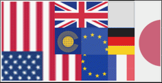
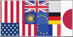
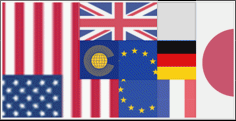
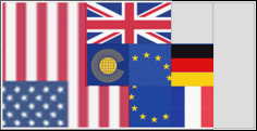
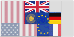
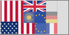
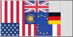
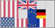
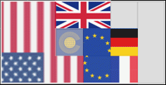
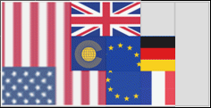
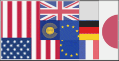
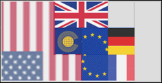
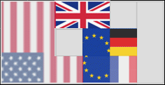
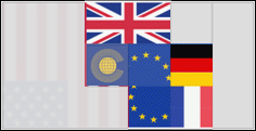
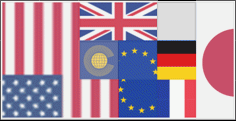
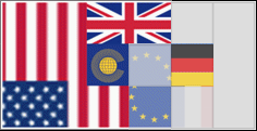
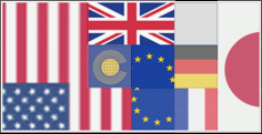
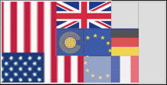
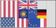
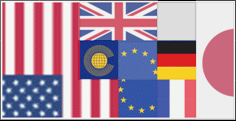
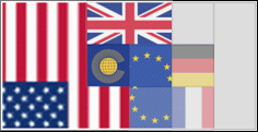
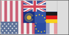
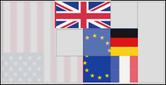
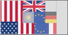
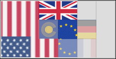
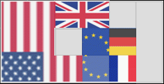
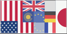
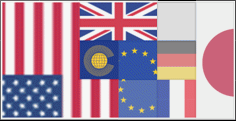
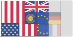
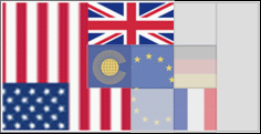
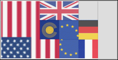
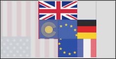
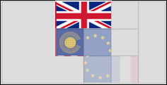
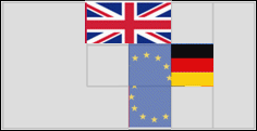
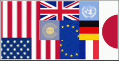
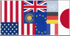
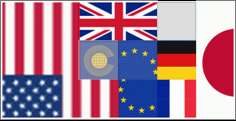
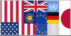
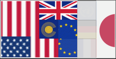
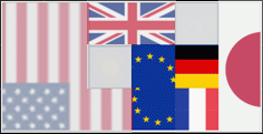
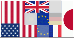
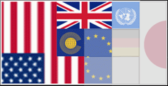
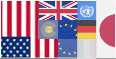
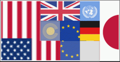
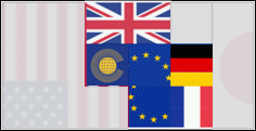
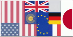
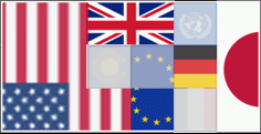
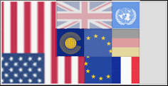
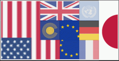
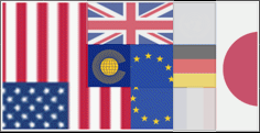
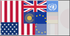
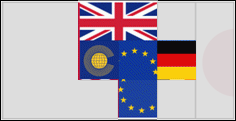
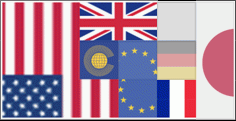
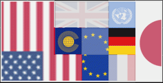
There are a number of pages where a "regional profile" has been included. These indicate how the data shown on a page relates to geographic regions, for example on an artist's song page they show how well that artist has done in the various song charts round the world. The key template is shown above, showing the nine regions displayed. Locations where the artist has had no success fade the flags to a grey colour. So for example the Abba songs had great success in Europe, some in the US and none in Japan.
The regions defined are the USA (7 squares), Japan (3 squares), UK (2 squares), Germany, France, North Europe, South Europe, other English Speaking and the Rest of the World. An explanation of why these regions have been selected (and why the sizes were set to these ratios) is given later in this page. On this page we show the results for artist songs, artist albums and song titles. We also have done some comparisons of these results across regions to show how they relate to each other.
Artist Song Success
The pictures in this section show the song based success of different artists, the numbers are based on unadjusted scores which means that modern acts are over represented. In addition before 1950 there is not much data from anywhere other than the US and the "Rest of the World" so the other regions won't show much success if an act comes from before then.
Here are the artist profiles for the 60 artists with the most success in the 143 song charts at the time the data was processed:
Artist Album Success
The pictures in this section show the album based success of different artists, the numbers are based on unadjusted scores which means that modern acts are over represented. In addition unlike the song data the album charts do not adequately cover Japan and the Rest of the World.
Here are the artist profiles for the 60 artists with the most success in the 95 album charts at the time the data was processed:
Song Titles
The pictures in this section show the success of different song titles in the regions. The much larger pool of possible song titles means that each one has to have a greater level of success to show in a region. Here are the region profiles for the 20 most successful song titles:
Why These Regions?
The regions were originally defined based on the IFPI data from 2003. Having previously tried a number of alternate ways to group the data (for example by region, North America against Europe) we found that dividing into these 10 regions (9 geographical and one for the Internet) delivers some reasonable results for looking at regional success. Basing the market estimates on the 2004 IFPI figures, which was the last year they listed all the countries, we get a similar profile:
| Region | Countries | Market | Code | Market Share | |
| United States | 12153.4 | usa | 36.2% | ||
| Japan | 5167.8 | jap | 15.4% | ||
| United Kingdom | 3508.7 | gbr | 10.4% | ||
| France | 2149 | fra | 6.4% | ||
| Germany | 1979.3 | ger | 5.9% | ||
| Southern Europe | Italy, Spain, Austria, Switzerland, Portugal, Greece, Hungary, Czech Republic, Croatia, Bulgaria, Romania, Slovakia, Slovenia | 2111.1 | seu | 6.3% | |
| Northern Europe | Netherlands, Belgium, Norway, Sweden, Denmark, Finland, Poland, Estonia, Latvia, Iceland | 1753.4 | neu | 5.2% | |
| Anglophone | Australia, Canada, South Africa, Ireland, New Zealand, Hong Kong, Singapore, Zimbabwe | 2052.8 | eng | 6.1% | |
| Others | Russia, Brazil, Mexico, China, Turkey, India, Taiwan, Thailand, South Korea, Indonesia, Argentina, Colombia, Israel, Ukraine, Chile, Malaysia, UAE, Saudi Arabia, Philippines, Pakistan, Central America, Venezuela, Egypt, Kuwait, Lebanon, Ecuador, Uruguay, Qatar, Peru, Bahrain, Oman, Paraguay, | 2738.3 | row | 8.1% | |
This division gives enough detail to show some interesting patterns without leaving any one region with so few inputs that the lumpiness of the input overwhelms the results. Each of the regions can be related to a multiple of 5%, so the USA gets 7 slots, Japan gets 3 and so on. This leads to the ratio of areas that we have used.
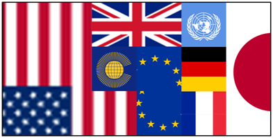
The next step is to arrange the areas. We started by trying to place each region in the location it would occupy on a standard world map. Once we had identified the regions that are similar we adjusted the map to bring them closer, for example the other English Speaking countries clearly need to be close to the USA and UK, the European countries must be grouped and so on. The various flags were all from Wikipedia.
The next step was to assign a value to each region for a particular item such as an artist. The various regions each have a different number of contributing charts, and these all cover different periods. So we had to sum the unadjusted scores across the region and then sort these and take the position of the item in the total list. Any item with a position of 1-10 then gets a transparency of 0% to 5%, a position of 100th in the list is a transparency of 30% and so on. The actual numbers were fine tuned to deliver a set of pictures that show the features.
How well do the regions match?
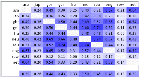
If the artist rankings are correlated between regions we get the mass of numbers pictured above. The darker blues indicate closer results. There are a number of features that can be seen here:
- The "Rest of the World" is the most distinct, this is probably mainly due to the small volume of data available
- Japan's taste in music is quite distinct from anywhere else, they are most similar to the smaller European countries
- Apart from France the rest of Europe (including the UK) form their own block
- Within Europe there are pairs that tie together like North & South Europe and Germany & South Europe. The closeness of Germany and the UK was a surprise
- The US, UK and other English speaking countries are all quite close to each other
- Charts from the Internet track the US, UK and other English speaking countries (this may be selection bias since we all speak English)
Data Source Versions
The process of calculating these metrics is quite complex, for that reason the data shown is not recalculated when the site is generated. The data was calculated as follows:
- Artist Song Data: from version 1.8.0034
- Artist Album Data: from version 1.8.0034
- Song Title Data: from version 1.8.0035




The comments here are from the the MusicID impact site site. This version is not able to accept comments yet
12 Apr 2016
Japan
In your graphics shouldn't you reduce the size of Japan's share. We are really only talking about English-language songs/albums
That is a valid point